

Living Room Wall Art Made Easy: 16 Ideas for Every Kind of Wall
Plenty of homes have a piece of art tucked away somewhere that never made it onto the wall.
Maybe it’s a print still in its cardboard tube. Maybe it’s a frame leaning behind the sofa because nobody could agree on where it should go, or how high. Meanwhile the wall it was meant for stays bare, month after month.
Hanging art is one of those jobs that looks simple and somehow isn’t. You worry about putting holes in the wrong place, choosing something too small, or ending up with a wall that looks random instead of planned.
This guide starts with the few measurements that solve most of that worry. After that come 16 living room wall art ideas, grouped by the situation you’re in: a big wall above the sofa, a rental where you’d rather not drill much, a wish for something other than a print, a room that needs more personality, and those awkward spots every living room seems to have.
Three Measurements That Do Most of the Work
Before choosing any art, it helps to know where it will sit and how big it should be. These are common starting points rather than strict rules, and your eye gets the final say.
Height. A common starting point is to hang art so its center sits somewhere around 57 to 60 inches (145 to 152 cm) from the floor. Rooms with very high ceilings, art viewed mostly from a seat, or large groupings may look better placed differently, so treat it as a place to begin testing.
Above furniture. When art hangs over a sofa or console, a starting range of roughly 6 to 10 inches (15 to 25 cm) between the furniture and the bottom of the frame often keeps the two looking connected. Furniture height, artwork size, and ceiling height can all shift that.
Width. Two thirds of the furniture’s width is one useful starting point for testing scale. A small piece over a long sofa can easily look lost.
When art hangs above furniture, its relationship to that furniture usually matters more than its distance from the ceiling.
For the Big Wall Above the Sofa
This is usually the largest open wall in the living room, and the one people put off longest.
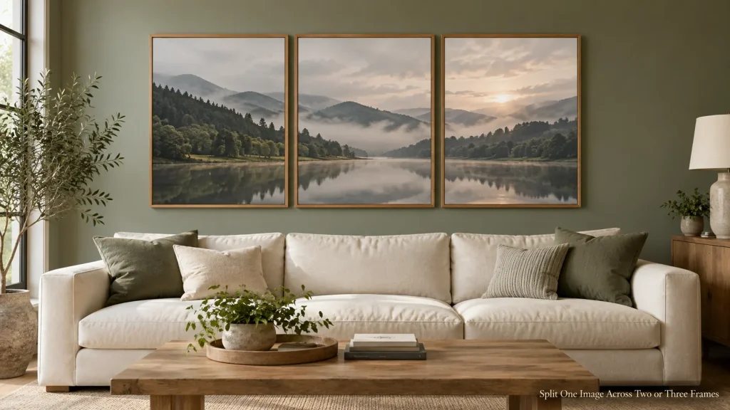
Split One Image Across Two or Three Frames
A diptych or triptych is a single image, or a set of related images, divided across two or three matching frames. It fills a wide wall without needing one huge, expensive piece.
The spacing between frames matters more than people expect. Keeping the gaps narrow and consistent, often just a few inches, helps the eye read the set as one artwork rather than separate pieces. The right gap depends on the size of the frames, so test it on the floor first.
This works especially well above a long sofa, where a single standard-sized print might look too small. Many artists and print shops sell images already split into sets, but you can also choose two or three separate prints with a shared color or subject.
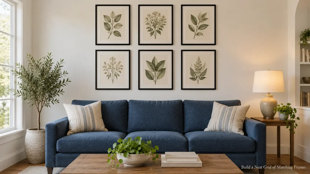
Build a Neat Grid of Matching Frames
A grid of identical frames, such as six or nine of the same size and color, has a calm, ordered look. The repetition lets you use smaller or simpler prints, like botanical drawings, black and white photos, or a series of postcards.
Precision matters here. Measure carefully, use a level, and aim for consistent gaps. Hanging hardware with a little sideways adjustment can help you line things up after the nails are in.
A grid can add structure to a room through its repeated lines and spacing, which can be a nice contrast in a more relaxed or eclectic space.
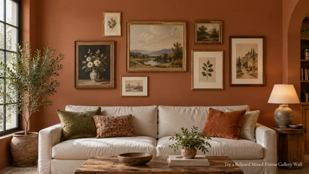
Try a Relaxed Mixed-Frame Gallery Wall
A mixed gallery wall combines different frame sizes, colors, and kinds of art in one loose arrangement. It’s more forgiving than a grid and can grow over time.
Some kind of common thread helps it look connected. That could be a consistent frame color, a shared color palette in the art, or simply similar spacing between pieces.
One approach is to start with a larger anchor piece and build outward from it, adding smaller pieces around it until the group fills the space you’ve marked out.
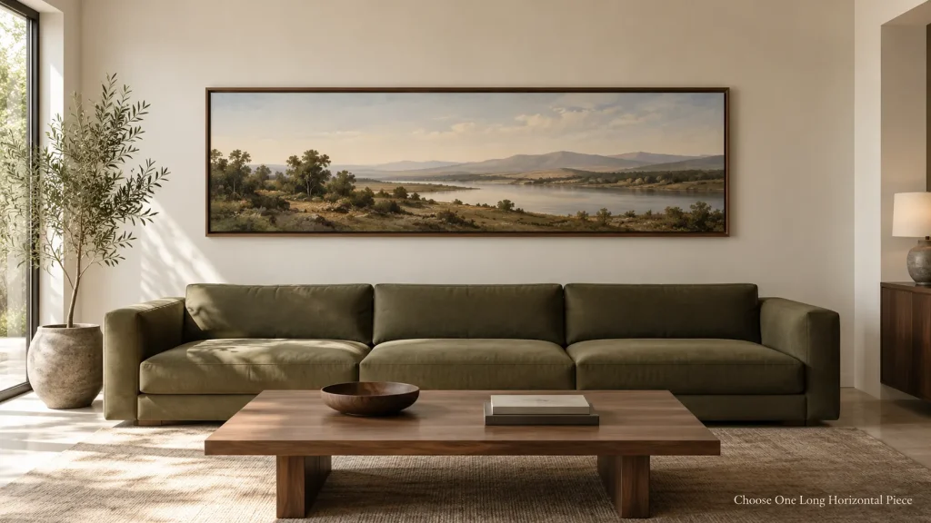
Choose One Long Horizontal Piece
Many ready-made frames are portrait-shaped or close to square. A long panoramic print, a horizontal landscape painting, or a row of three small canvases joined visually as a strip can echo the low, wide shape of a sofa or console.
It also gives a calmer look than a gallery wall if you prefer fewer frames, and it’s easier to hang, since there’s only one piece to level.
If You’d Rather Not Make Many Holes
Renters, or anyone who likes to move art around often, have more options than they might think.
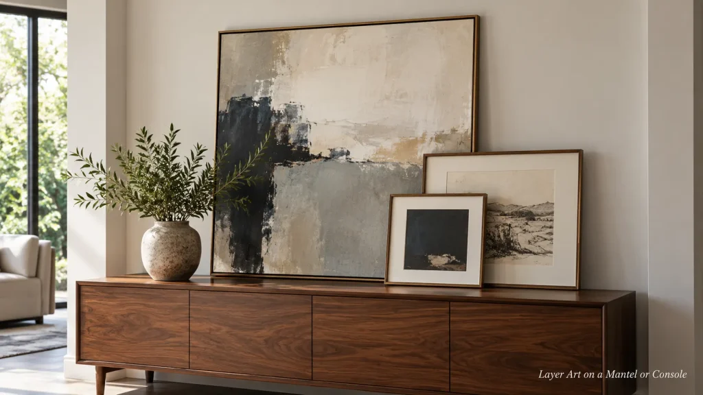
Layer Art on a Mantel or Console
Instead of hanging everything, lean a larger piece against the wall on a mantel, sideboard, or console, then place one or two smaller frames slightly in front, overlapping its lower edge.
This layered look is relaxed and easy to change. Museum putty, if it suits the surface and the frame’s weight, can help stop light frames from sliding. It isn’t a substitute for securing heavy pieces, though. Keep heavy or glass-fronted frames well back from the edge, and in homes with young children or pets, consider fixing larger pieces to the wall instead of leaning them.
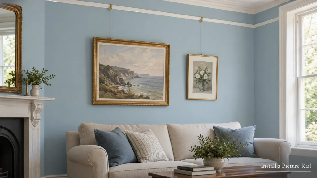
Install a Picture Rail
Picture rails were common in older homes. A slim molding runs along the wall near the ceiling, and art hangs from it on cords, chains, or wires with sliding hooks.
Once the rail is up, you can rearrange art as often as you like without any new holes. Several modern track systems work the same way and are fairly discreet. Check the rail’s rated load and install it using the fixings specified for your wall type, and ask your landlord before installing one in a rental.
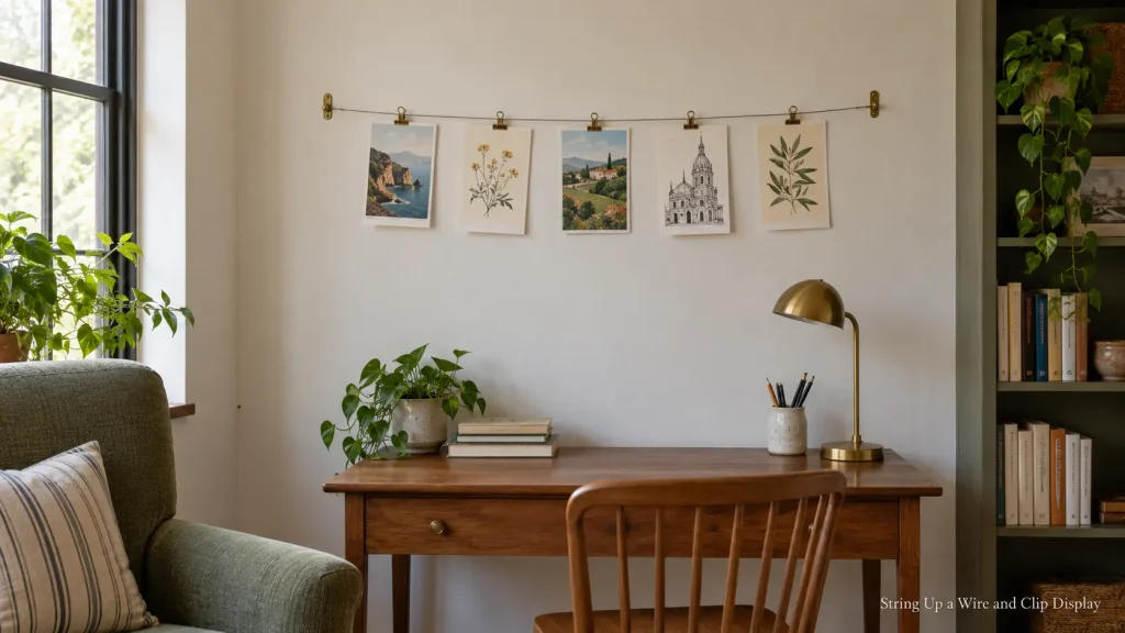
String Up a Wire and Clip Display
A thin wire or cord stretched between two hooks, with small clips holding unframed prints, photos, or postcards, makes a casual display that changes easily.
It suits a reading corner, the wall beside a desk in a living room, or a space where children’s drawings rotate often. Since it only needs two fixings, it’s a low-hole option, though it’s still worth checking what your lease allows.
Keep it to one row or two at most, and leave a little space between items so the display looks deliberate rather than cluttered. Pulling the wire fairly taut stops it from sagging in the middle.
Art That Isn’t a Framed Print
Living room wall art doesn’t have to mean paper behind glass. These ideas bring in texture, shape, and depth.
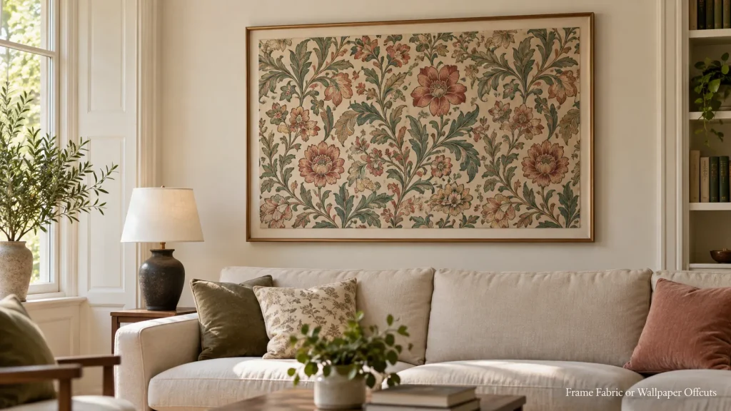
Frame Fabric or Wallpaper Offcuts
A beautiful scarf, a piece of vintage fabric, or a leftover roll of patterned wallpaper can look striking in a large frame.
For fabric, stretching it over a canvas frame or mounting it on board keeps it smooth. For wallpaper, a single panel in a slim frame works well. Both are budget-friendly ways to bring bold pattern into a room without committing to a whole wallpapered wall.
If the fabric is delicate, valuable, or sentimental, consider professional framing, which can include suitable backing and UV-protective glazing, and keep it out of direct sunlight, which can fade it over time.
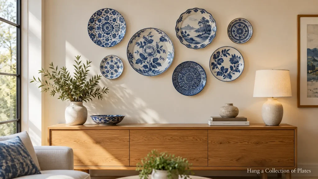
Hang a Collection of Plates
Decorative plates on the wall have a long history, and a group of them can look fresh in a modern room. Mismatched blue and white plates, plain white ceramics in different shapes, or handmade pottery all work.
Use plate hangers or adhesive plate discs that meet the manufacturer’s weight and surface requirements for each plate, and test the arrangement on the floor first. A loose cluster can create a relaxed grouping, while a straight row or a symmetrical arrangement looks more formal.
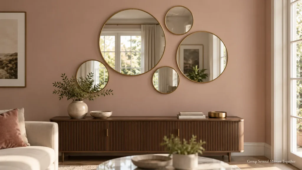
Group Several Mirrors Together
A cluster of mirrors in different shapes and frames adds light as well as interest. It can work especially well in darker living rooms or on a wall opposite a window.
Choose mirrors with a common element, such as all brass frames or all round shapes in different sizes, so the group looks planned. Use mounting hardware suited to the mirror’s weight and your wall construction, following the manufacturer’s instructions.
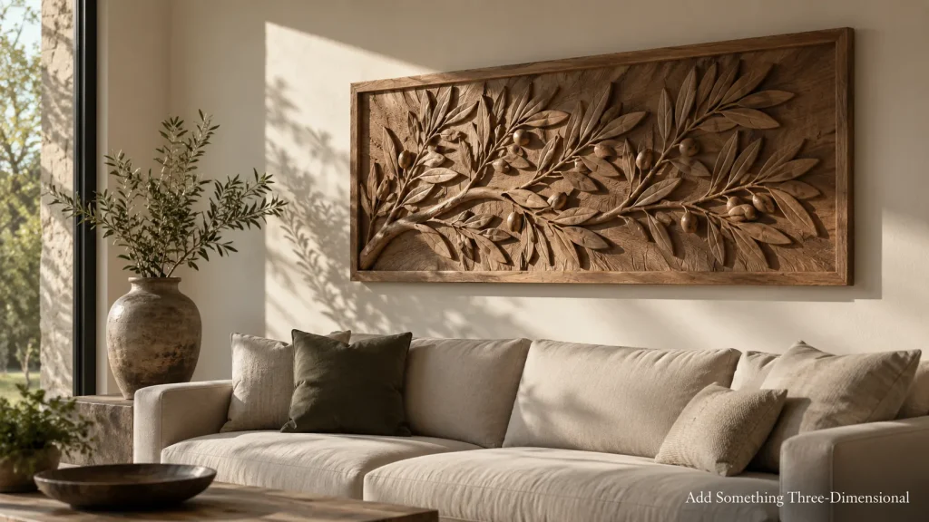
Add Something Three-Dimensional
Carved wood panels, metal wall sculptures, or woven hangings add depth that flat art can’t.
Because they stand out from the wall, these pieces cast shadows that shift as the light changes. Lighting from the side, such as a lamp or a picture light angled across the wall, brings out that texture in the evening.
Check the weight and fixings carefully, since three-dimensional pieces are often heavier than they look.
Art With a Personal Story
The most memorable living room wall art often means something to the people who live there.
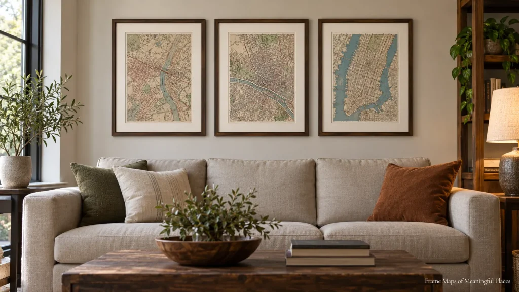
Frame Maps of Meaningful Places
A map of the city where you met, the town you grew up in, or a place you’d love to visit makes personal art that still looks graphic and clean.
Old atlases from secondhand shops are a good source, as are printed maps you can order online. Framing three maps in matching frames, each of a place that matters to someone in the household, turns them into a small collection. Using similar crop proportions and the same mat width for each map helps them sit together neatly.
Give Children’s Art a Proper Frame
A wide mat and a simple frame can give children’s art a clean, intentional presentation. The mat gives the piece breathing room on the wall.
Frames that open from the front make it easy to swap in new pieces, so the display grows along with the child’s work. Choosing a few favorites each year keeps it manageable.

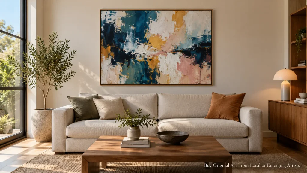
Buy Original Art From Local or Emerging Artists
Original art is available at many price points. Art school graduate shows, local markets, open studio events, and online marketplaces for independent artists often have affordable pieces.
Owning a one-of-a-kind or small-edition piece, especially from someone whose work you’ve seen in person, adds a personal connection to the wall. Many artists also sell smaller studies or works on paper at lower prices than their main pieces.
For the Tricky Spots
Every living room has a few awkward walls. These ideas are made for them.
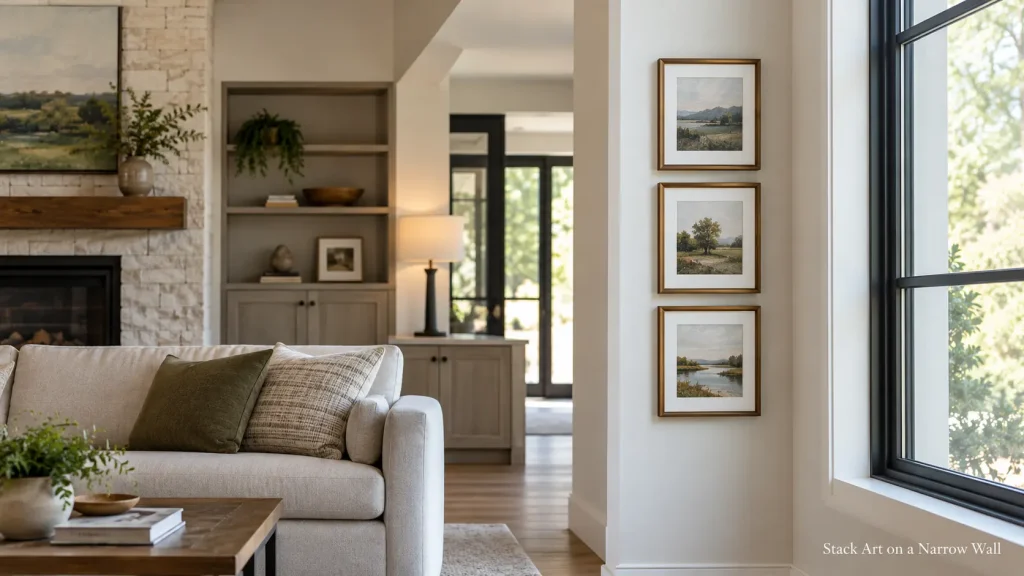
Stack Art on a Narrow Wall
The thin strip of wall beside a window, between two doors, or next to a bookcase often gets left empty. Two or three small pieces stacked vertically, one above the other, suit that tall, narrow space.
One approach is to keep the gaps fairly tight and the frame widths similar, so the stack reads as one column. The same idea works on the short wall at the end of a sofa or beside a fireplace, and lining the stack up with something nearby, like the edge of the window frame or the side of a bookcase, makes the placement look planned rather than squeezed in.
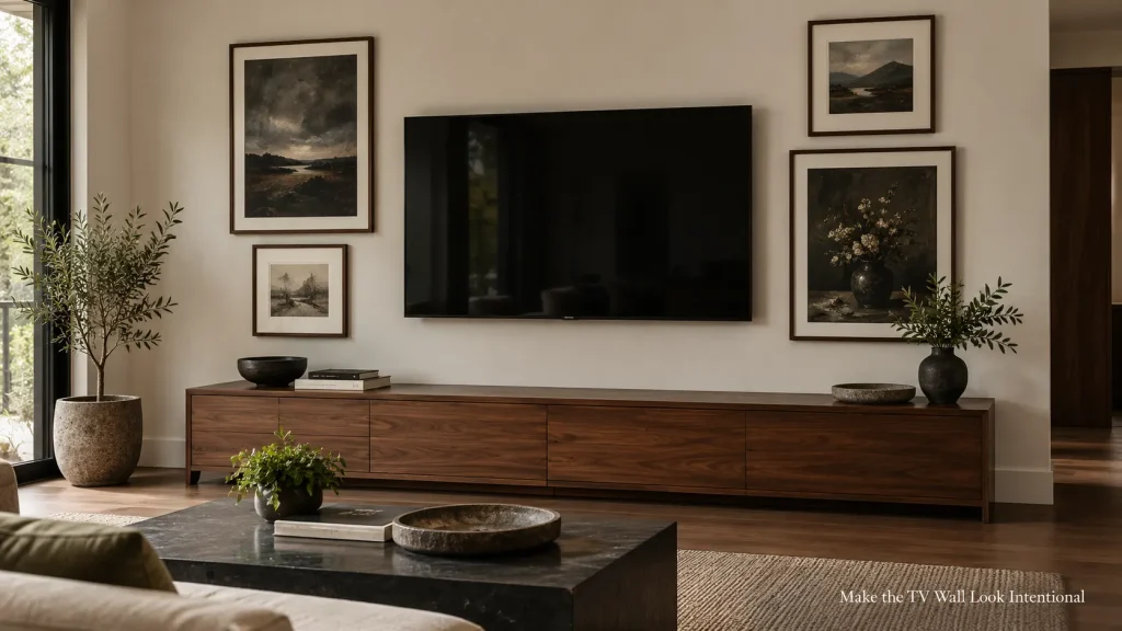
Make the TV Wall Look Intentional
A large black screen can dominate a wall. If you already like gallery walls, surrounding it with art can help it blend in, since it becomes one dark rectangle among several frames. If you prefer a calmer look, a single piece on either side, or none at all, may suit you better.
Art with some darker tones or black frames helps the TV look less isolated. Follow the TV and mount manufacturer’s clearance and installation instructions, and keep frames well clear of the bracket.
Try It on Paper Before You Drill
This step can save a lot of unnecessary holes.
Trace each frame onto kraft paper or newspaper and cut out the shapes. Mark where the hanging hardware sits on the back of each frame onto its paper template. Then tape the templates to the wall with painter’s tape.
Leave the templates up for a while and move them around until the arrangement looks right from the sofa, the doorway, and anywhere else you usually sit. When you’re happy, use the marks to install the hanging hardware that suits your wall and each frame, then tear the paper away.
Mistakes That Make Wall Art Look Off
Hanging art where it’s hard to see. A piece tucked behind a door that usually stands open, or above a tall cabinet, rarely gets looked at. Choose walls you actually face.
Forgetting what’s behind the wall. Light switches, outlets, thermostats, and hidden pipes or wiring can all get in the way. Check before drilling, especially near outlets and switches.
Ignoring light and glare. Glass-fronted art directly opposite a bright window can reflect so much light that the art is hard to see. Anti-reflective glazing or a different wall can help.
Using the wrong fixings. Heavy frames, mirrors, and three-dimensional pieces need hardware rated for their weight and suited to your wall type.
Questions About Living Room Wall Art
How many pieces should go above a sofa?
There’s no set number. One large piece, a pair, a set of three, or a full gallery wall can all work. It mostly depends on the size of the wall and whether you prefer a calm or busy look.
Can I mix photos and paintings on the same wall?
Yes. Mixing types of art is common. Similar frames or mats can help photos and paintings look like they belong together, even when the images are very different.
Do I need special lighting for wall art?
Not necessarily. Many living rooms rely on lamps and daylight, and that’s fine. If a piece looks dull in the evening, a plug-in picture light or a lamp angled toward the wall can help. Keep light sources a little away from delicate originals, since strong light over time can fade some materials.
How can I hang art on a plaster or brick wall?
Wall construction varies a lot, so follow the hanging hardware manufacturer’s guidance for your wall type and the weight of the piece. Check for pipes or wiring before drilling, and if you’re unsure what your wall is made of, a handyperson can help.
Fill the Wall You’ll Look at Most
You don’t need to decorate every wall at once. Start with the one you see from your usual seat, because that’s the view you’ll live with every evening.
Art doesn’t have to stay where you first hang it, either. A picture rail, a mantel, or a few spare frames make it easy to swap pieces over time, so the wall can change as your collection grows.